
.png)

BE KIND - BE BENIGN - BE ENGAGED
Eco- friendly shop

ROLE: UI/UX Designer
TIMELINE: September 2022 (3 weeks)
Brand
Building

Overview
Lành Station is an e-commercial responsive web app to help everyone find eco products quickly and easily to match their particular needs. The app is designed with different categories, high quality images, simple checking out and purchasing process hope to bring the best shopping experience to customers. Lành Station app is responsive for both mobile and desktop, users now can shop everywhere at anytime.
Lành Station was established as an initiative to reduce the amount of single use plastic packaging or hard to decompose products, which includes common household products. We also pay attention to the components in each product and always prioritize the use of natural ingredients in the production process.

Why us?
Users don’t have the time or ability to visit physical stores and would rather buy on the go or from home. It’s also more convenient to try out the items and easily return those that aren’t desired or appropriate without having to return to a physical store.
In the pandemic, your online shopping is even more sustainable, with less plastic packaging and less CO2 emissions, with our refill service at your door.


Workflow
Research and
Brand Building
-
Competitor researching and analyzing.
-
Creating a brand and positioning it.
-
Making brand guidelines document and guiding principles.
Animation &
Mock-up
-
Make a quick prototype and get feedback.
-
Define and apply more detail technique for final prototype and mock up.
UI Design and Prototyping
-
Finessing user interface design.
-
Desktop designing.
-
Making animations.
Sketching and Wireframe
-
Drawing the User flows and Diagram to have a clearer picture.
-
Conducting user testing on Mid-fidelity wireframe and refine the flow as well as the design.
WEEK 1
WEEK 2 - 3
I studied an eco friendly brand and three major eCommerce apps to understand the market as well as get inspiration.

When collecting enough materials, I started to carve out the idea by building its skeleton.
BE KIND
Being kind allows us to communicate better and also to be a positive force in people's lives. Being kind to not only to ourselves, our customers, but the environment, the habitat that we are living in.
Guiding
Principles
BE BENIGN
We pay attention to the components in each product and always prioritize the use of natural ingredients in the production process. Life is rough already, let both our soul and body be touched mildly.
BE ENGAGED
"Living green" is not a privilege for only rich people. We are engaged to the community by pricing products suitable for multiple type of customers. To more people have chances to use local and sustainable quality products. Everyone can be a changemaker.

Logo
In Vietnamese, Lành means Benign, to describe a mild type or character that does not threaten health or life. We want to emphasize nature and simplicity in our logo.


-
Our logo is made up from two typefaces: The word Lành is set in Breul Gortesk bold at 118 tracking. The word Station is in Montserrat bold 12.
-
Our logo can only be set horizontally.
-
The logo can be green, black and white, which ever is most clear on your background color or design.
-
In case needing to use background, you must use three sets that we provide above, which ever works best with your design.
-
Tagline "be kind - be benign- be engaged" in Montserrat regular 30. It can be green, black and white, which ever is most suitable with our logo on your background color or design.
Style Guide


Sketching and Wireframe
User Needs
-
As a new customer, I want to access the inventory without having to register, so that I can make sure this store has what I’m looking for before having to create an account.
-
As a customer, I want to be able to place multiple items in a shopping cart, so that I can purchase more than one item at a time.
-
As a customer, I want there to be a variety of payment options, so that I can choose the payment method that suits me best.
Based on User Needs, I created 3 user flows for Inventory, Shopping Cart and Purchasing Process to solve there problems
User Flow and Diagrams

Sketching low fidelity wireframe
Mid fidelity wireframe


UI Design and Prototyping

After Sketching out the ideas, I made a quick prototype for users to test out one flow. Withdrawing some critical feedback from them, I refined the design and solutions.
Scenario: You are a new user and would like to buy eco-friendly products from Lành Station. Which steps would you take to accomplish this task?
Positive feedback:
-
"With buying I have no problems"
-
"I think the checkout process is very well planned and very clean"
Critical feedback:
-
"The Menu button is positioning strange and I never expect Shop section in Menu.”
-
"What are "pictures/videos"? Are they picture of products? Are they clickable?”
-
"As a new user I expect to see Shop Icon or clickable picture that link me to product detail. But it seems that it’s not a option.”
-
"I wanted to try the search function because I don't know if the app just offers Lành Station products or different products and I have to search for them. Since this wasn't the option I went to the menu and to kitchen and put a product to my cart."
User Test Analysis
-
Critical:
- Make two more screens for Search and Filters.
- Make high fidelity wireframe and prototype.
-
Preferential: Sections in Menu are strange => This is just reference. The design is actually not that strange and user will learn how to use very quick.
Final design & Solutions
Animation &
Mock up
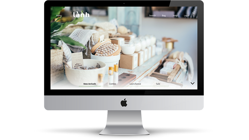
Home screen and Navigation are aesthetic and cohesive for users to understand the structure of the application and search for the things they are looking for


.png)


Transparent info of Ingredients, Benefits, and Caution for trust worthy products.
Friendly and simple Purchasing process make it the fast and convenient for customers.
Product gallery shows different visual angles of the item on how its look and use.


Onboarding integrated with elegant Home screen gives better structure for users to explore before Sign in
Friendly navigation bar with well organized menu provides interesting interactions


High quality images putting in nice concept with clear name and price brings better sense of use for customers.
Wish list can add into Bag or Send to friends easily. Recommendation is customize based on users' interests
Shopping bag allows to place multiple items and can purchase more than one item at once.


Transparent checking out flow creates a sense of trust worthiness and meaningful since customers know that they contribute to the community and environment while shopping


We bring living green
to everyone!
.png)
